Brief
100% Natural. That is the philosophical backbone of Quntal. And they were looking for a solution that connects all of their actions and elements into this fundamental essence.
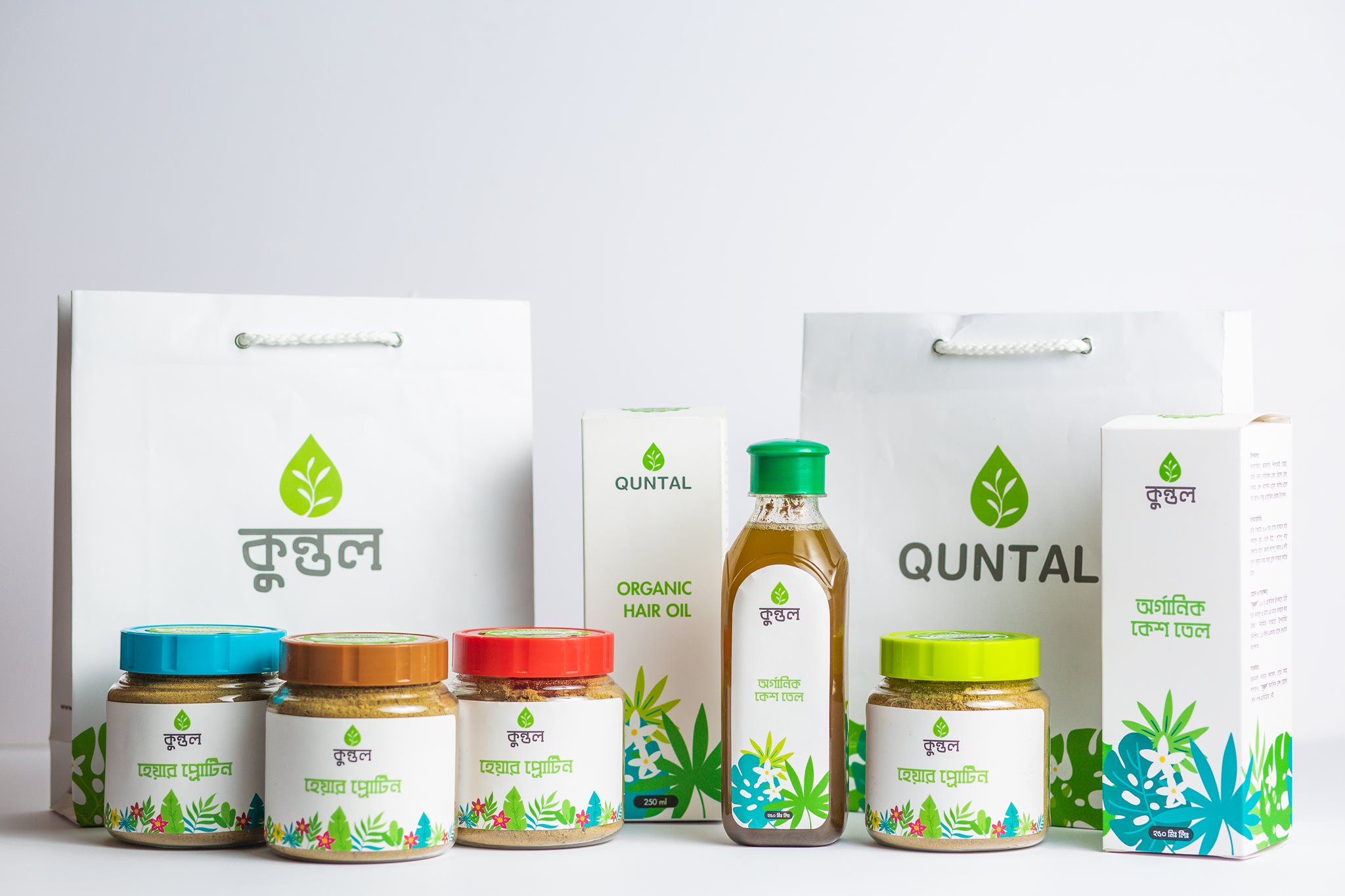
Quntal is trying to offer care products to its customers which are made in herbal manner and have belongingness with nature. Each of their products should deliver a vibe of nature . There is a strong customer base for Quntal. But the communication through visual elements and contents were needed. On the other hand, the brand had some room for improvement in terms of connecting dots.
Process
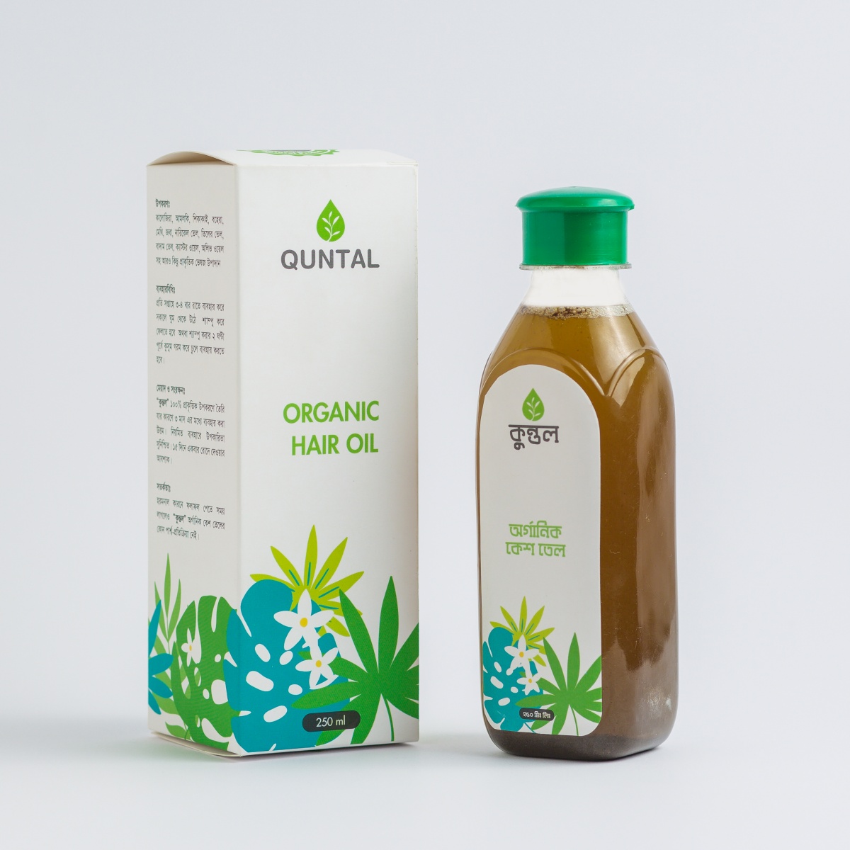
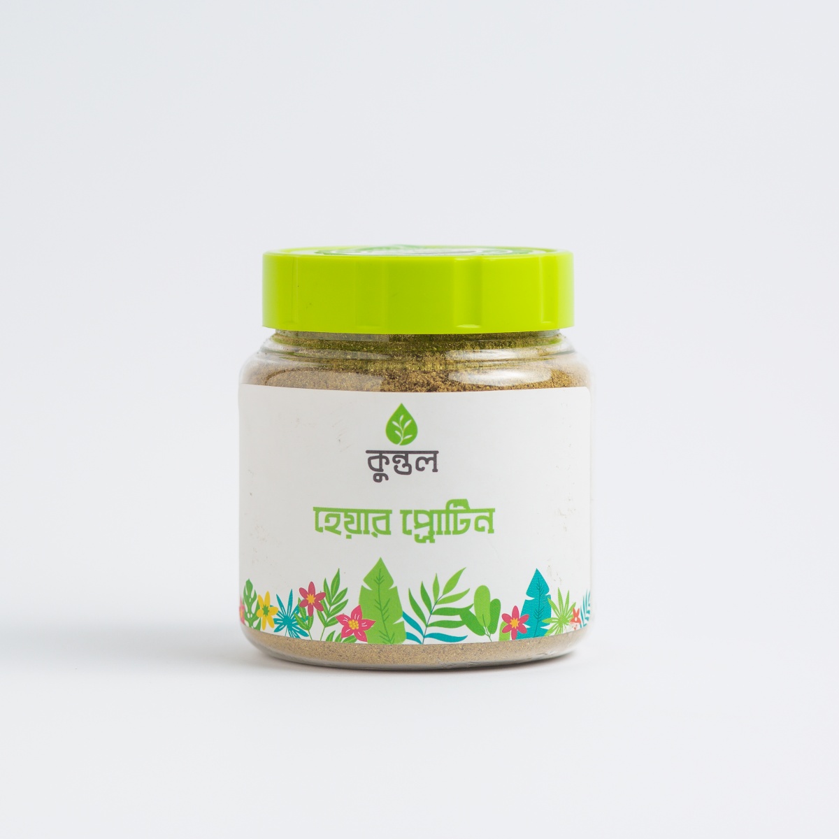
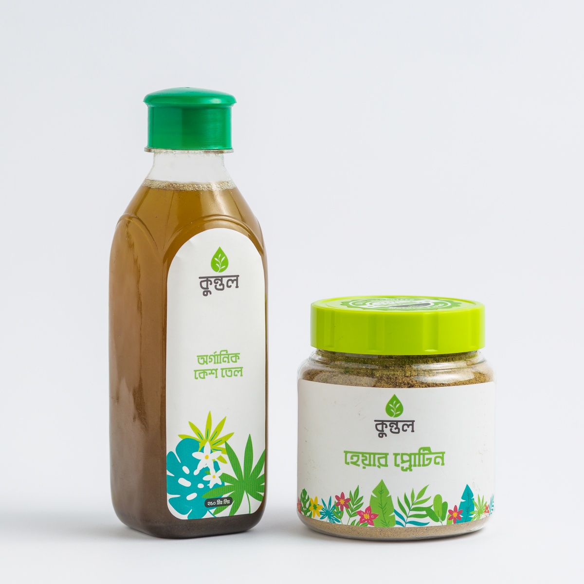
From our in-house research, We’ve realized that Quntal required changes in one core area; design of product packaging
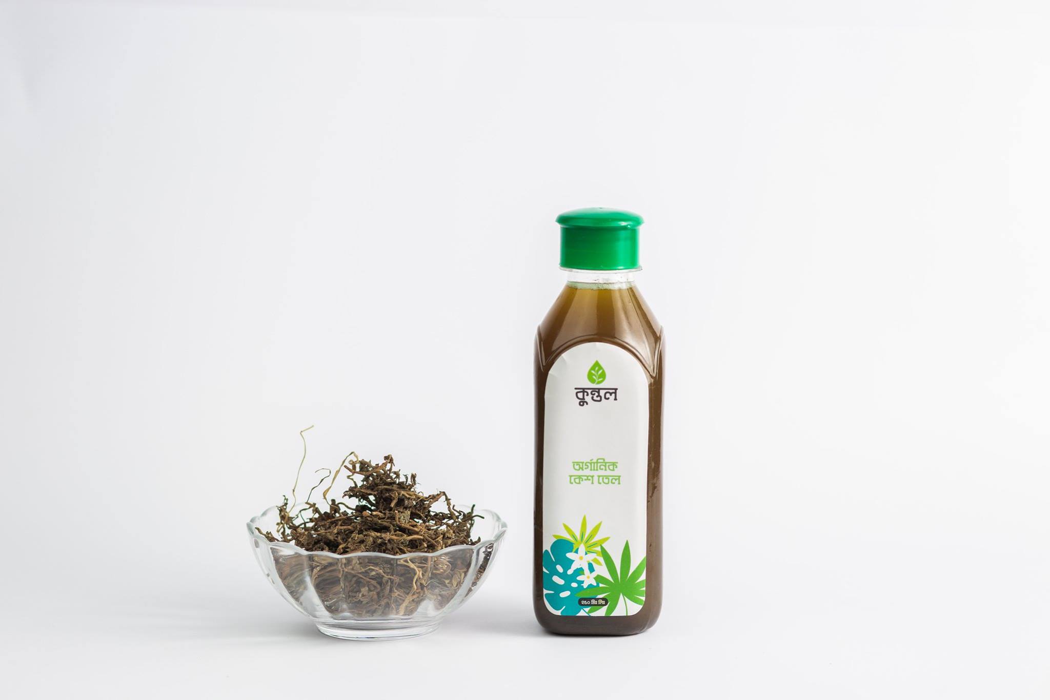
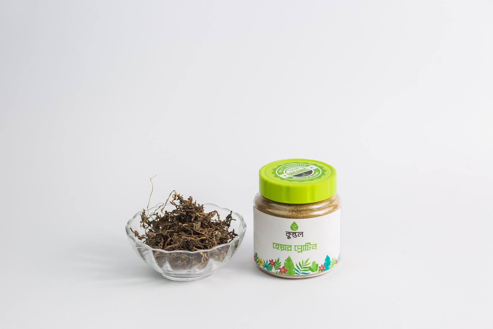
The word “Quntal” which derives from sanskrit term, means “hair”. Adapting ancient language is an attempt to show brand’s dedication to seek root in their products. The core challenges in terms of graphics were to make a design that merges both core essence and quality in terms of printing. Following their brand’s color palette and adapting with the leaf from their logo, packaging design was made.
Result
Quntal have successfully expressed itself as a signature brand for herbal and natural committment
Due to trustable positioning in the market and reflective efforts in branding, graphics as well as packaging design, Quntal can now pride itself for being expressing its commitement that become a role model for other brands.
“We really liked the packaging design``


